
Energy monitoring isn’t only about knowing what’s happening right now, but also understanding what happened historically. Often that includes knowing not just what was happening but also when and why. Enter cloud services for energy monitoring. They range from simple charts and graphs to predicting your usage over time – essentially storing, analysing and enriching your raw data.
In this post I review two cloud services that I’ve tried so far and show you what you get from them.
This is part 2 of a series of posts about the Internet of Things applied to Home Energy Monitoring.
See my posts from Day 1: getting started – Day 3: main charts and analytics in the dashboard
Cloud Service Options
The rainforest automation Eagle unit I have comes pre-configured with support for a few different cloud services: Wattvision, BuildingOS, Bidgely, BlueDot. (Ignore the Powereye entry for now, that’s just me mucking around).

Eagle monitor cloud service configuration options
To enable a service:
- Create an account on the website for one of the services (links above)
- Provide them with your Cloud ID as shown in the config screens on the Eagle
- Select the cloud provider in the Eagle settings and choose Set Cloud
- Wait – Give it a minute to get started. It will restart some stuff on the Eagle device
- Visit the service provider website to see what’s going on

BlueDot service config screen

Bidgely energy monitoring config settings
Behind the Scenes
What exactly happens when you choose a cloud provider in the Eagle settings?
When one is chosen, the Eagle device will transmit the energy data to the provider. Along with your device identifier, with every reading it generates a data packet for the provider to read and use in its system. The system detects that it’s your data and makes it available to your account.
The bonus is that this results in you essentially having a copy of the data available elsewhere, on another server. What that server does with it after is its own business. Each provider has their own website tools and/or mobile apps that access your data and the results of their services.
So don’t expect anything on the Eagle screens to change when these are configured, it’s only sending a copy of the data and you have to go to those other sites/apps to get the added value.
As an aside, you could even set up your own server and stream your data to it! More on that in the future.
BlueDot
BlueDot was the first service I tried. It provides a very basic set of features, pretty much all being shown in this chart summary screen.

BlueDot Energy Monitor Dashboard
The charts seem to show the data in 15 minute increments.
I haven’t run it long enough to really get full value from the service. At the bottom of the screen there is a My Recommendations section. As it analyses more data it will add value in this spot. They explain on their website:
Our cloud-based servers constantly analyze your home energy usage and use this information to create personalized money-saving recommendations and special offers. These recommendations are sent to the “Just For You” page in your BlueDot web browser or smartphone application.
Sounds good to me! I hope to give it a more thorough test in the future.
If all you want is a simple chart right out of the box, this was very easy to get started with.
Bidgely
Most of the past day I’ve been running with the Bidgely service, so I’ve now got 24 hours worth of data to show.

Bidgely Energy Monitor Dashboard
The dashboard is rich with information. There are also two chart views, one showing usage (“demand”) and one showing an energy billing estimate.
During the configuration stage you tell it what utility you are getting your energy from and it will config the rate.
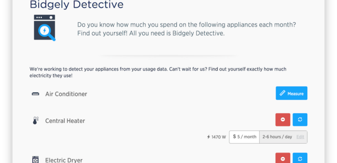
The most interesting part of Bidgely is the application of data analytics. To start with, they have a tool that helps you train their system and to give you an estimate of how much it costs you to use an appliance. You can use the mobile app or the website to tell it, for example, that you are going to turn on your air conditioner. The service will watch for a few seconds or a minute and identify what kind of spike that device creates.

Bidgely Appliance Detective Mode
It is actually fun to go through their list and activate all the appliances you own!
The list is not comprehensive yet but I expect it will become longer in the future. Based on comments in their community forums, users also want to be able to track other appliances or even their custom ones.
Bidgely’s main focus is not just on showing the data, but on identifying which appliances use what amounts of energy. You can see this in the dashboard screen in the centre-left. I called my system Whole House. They automagically created a sub-group called Always On – that’s the baseline usage that never seems to go away. I’ll be attacking those energy vampires in the future too!
As they collect more data, my appliances will start to show up here as well. That will be really cool. I’m not sure how long it will take, but sounds like it might take a month or two before that happens.
At the end of the day I’ll be able to see which appliances use the most power and then adjust accordingly.
Summary
So far I haven’t made any huge discoveries or conclusive decisions for how to save on energy. However, I did realise that the water heater is a secret sucker – it is so far out of sight and mind that I didn’t even think about it until I saw a strange plateau spike up at 11pm – when I had already shut down all my appliances and after I had showered before bed.
My space heaters are the largest culprits so far and next is the oven. I figured this out just by looking at the times and watching what was going on around me.
At this pace I’ll soon be able to have my own, personal, conclusive evidence of which is better for heating tea – microwave or stove top. Then everything will be right in the world!
Stay tuned for a review of more cloud services in my next post of this series. Find me on Twitter to share more ideas or leave a comment to tell me what other areas you would like to learn about on this topic.
- Geography + Data - July 15, 2021
- DIY Battery – Weekend Project – Aluminum + Bleach? - January 17, 2021
- It’s all about the ecosystem – build and nurture yours - May 1, 2020
- Learnings from TigerGraph and Expero webinar - April 1, 2020
- 4 Webinars This Week – GPU, 5G, graph analytics, cloud - March 30, 2020
- Diving into #NoSQL from the SQL Empire … - February 28, 2017
- VID: Solving Performance Problems on Hadoop - July 5, 2016
- Storing Zeppelin Notebooks in AWS S3 Buckets - June 7, 2016
- VirtualBox extension pack update on OS X - April 11, 2016
- Zeppelin Notebook Quick Start on OSX v0.5.6 - April 4, 2016
Hi Tyler, I just found your blog. I have the original Eagle and looking to use cloud service. Bidgely looks interesting.