
After a week of collecting smart meter readings, I’m now ready to show results in a cloud-based energy monitor system – Bidgely – complete with graphs showing readings, cost and machine learning results breaking down my usage by appliance.
 This is part 4 of a series of posts about the Internet of Things applied to Home Energy Monitoring. I have a Smart Meter from BC Hydro, an Eagle energy monitor and various cloud apps helping me understand it all.
See my post from Day 1 – getting started or Day 2 – connecting to cloud services – Day 3 – viewing data
3 Value Added Parts to Bidgely
In this post I’ll show you the three parts of Bidgely that I’ve found most helpful:
- Usage dashboard
- Cost dashboard
- Appliance breakdown (best for last!)
Usage Dashboard
Bidgely Energy Monitor – Usage Dashboard
The main part of the dashboard includes the energy usage during a given period of time – in detail and an overall amount. The usage dashboard is chosen by selecting the lightning bolt symbol in the top right. On the top left you change the time period for the dashboard. Changing it to Billing Cycle or Year will summarise the data into larger groups of time – days or months.
In the 24 Hour time period, the chart shows the amount of kilowatts used in 5 minute time periods. You can mouse-over a point and get the detailed information. This view helps you to understand what your energy usage is like and can help you identify any usage you didn’t know about.
For example, the small spikes throughout the middle of the night were confusing at first, but I figured out that it was the refrigerator running every hour or so. This leads me to know that to reduce that usage I could get a more efficient fridge or take other actions such as placing some jugs of water in the fridge to help retain the cold better. We’ll try that another time and see what effect it has.
Cost Dashboard

Bidgely Energy Monitor – Cost Dashboard
Very similar to the usage dashboard, the 24 Hour view shows the cost of the usage summarised by hour, just as the hydro company will do their billing. This screen is turned on by the $ symbol button in the top right. Mouse over the chart shows more details, include any different Tier usage your utility may have in place.
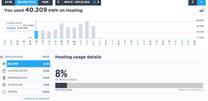
Appliance Breakdown
Now here is where the real secret sauce of Bidgely gets applied. Showing charts of usage and cost isn’t rocket science, but applying machine learning to gaining further insight into your usage/costs is really useful. Let’s look at an example in this screenshot. Notice the bottom left shows a breakdown of usage by appliance. When you select one, it shows it in the chart and gives a summary % in the bar below the chart:

Bidgely Energy Monitor – Appliance Breakdown
This breakdown magically appears when their algorithms and machine learning analysis start to see patterns of usage in your data. Just like I could instinctively see my refrigerator usage, data analysis can detect similar patterns and make certain assumptions. For example, my heating system draws 1.5kW, so when there is a 1.5kW increase in usage, the assumption can be that my heater turned on. That’s a fairly simple example that isn’t going to gain any venture capital funding.
Things get way more interesting when engineers can determine what appliances are running simultaneously. When a second appliance begins running, say my fridge, at another 0.8kW how can it figure this out? This takes a combination of factors – additional guestimates about typical fridge usage, as well as frequency and duration – together these produce a super smart system that can determine these factors.
The only downside I see so far is that this analysis happens after-the-fact. The initial analysis took about 3-4 days, then they emailed me to tell me they had discovered my “always on” usage, heating system, fridge and clothes dryer. I’m super curious if it will also find my water heater and another space heater I have. Time will tell.
Wish List
Real-time Analytics
I’m also curious if it can become faster at identifying these components. Not an easy feat but I’m sure it’s on their TODO list already. [Perhaps they need a higher performance analytic platform like we produce at Actian!] The closer to real-time that any analytics can get, the better for everybody and the wider the lead Bidgely will have on its competitors.
Manual Training
The other aspect to Bidgely I’d like to see is more ability to manually train their model. My premise here is that the user has innate knowledge about what is going on that a system might never really understand – this should be taken advantage of.
I mentioned in an earlier post that their Appliance Analyzer app helped train the model, but I’m not so sure now. I think it was only to give you a rough idea of your usage in a manual way (which is what they said it did). But it really should be used to train my house and could be done two ways.
First, just like their little wizard does – you identify what device you are using, select Start, turn it on and it tells you when it sees the spike – done. Second, show the current usage and allow the user to select from a checklist what is currently running.
Now, using all of that data in real-time on multiple devices that turn on/off over varying durations of time – that’s still the secret sauce this team brings to the table. I look forward to seeing how they move forward as they continue to develop. It is sure interesting so far!
Offline Updates
I prefer to power down my computer equipment in the evenings, though I keep my energy monitor running. When I power it back on it the morning Bidgely won’t update with the data collected earlier. This is not a unique problem to Bidgely of course, other cloud providers have the same issue, but my Eagle does support downloading older data – so hope they could take advantage of this sync/refresh approach in the future.
- Geography + Data - July 15, 2021
- DIY Battery – Weekend Project – Aluminum + Bleach? - January 17, 2021
- It’s all about the ecosystem – build and nurture yours - May 1, 2020
- Learnings from TigerGraph and Expero webinar - April 1, 2020
- 4 Webinars This Week – GPU, 5G, graph analytics, cloud - March 30, 2020
- Diving into #NoSQL from the SQL Empire … - February 28, 2017
- VID: Solving Performance Problems on Hadoop - July 5, 2016
- Storing Zeppelin Notebooks in AWS S3 Buckets - June 7, 2016
- VirtualBox extension pack update on OS X - April 11, 2016
- Zeppelin Notebook Quick Start on OSX v0.5.6 - April 4, 2016
No Comments Yet