

The Eagle energy monitor from Rainforest Automation is a very handy device. It reads the wireless signal from my electricity meter and makes it available through a web interface – both a graphical environment and a RESTful API. In this post we look at the standard graphical screens and the data download option. Next time we’ll look at the RESTful API for programmers to use.
This is part 3 of a series of posts about the Internet of Things applied to Home Energy Monitoring.
See my post from Day 1 – getting started or Day 2 – connecting to cloud services.
Eagle Energy Monitor – Current Usage Data
Aside from setup screens, there are basically three screens I’ve been using today.
The first is the Current Usage tab on the Meter screen. This shows how many kiloWatts you are currently using, in a handy dial shape graphic. Along with this is an estimated cost per hour. It seems to update every 5 seconds or so. Turning on Fast Update didn’t seem to do much faster, but maybe it just wasn’t noticeable on this screen.

Eagle energy monitor Meter/Current Usage screen
At the bottom of the screen there is another chart showing where my current usage sits in the multi-tier billing system that BC Hydro uses. It’s somewhat ominous to see it slowly marching over toward the much higher tier.
Eagle Energy Monitor – Historic Usage
The main screen I’m usually looking at is the History screen and the Demand tab:

Eagle energy monitor demand history
The data here is straightforward. Higher line means higher power draw from the utility lines. The different time windows – hour, day, week – will summarise the data into neater representations. As a result, you might see some wild fluctuations disappear when you view a longer period of time.
The Consumption option shows a slightly different view of the world. This chart represents more of how the electricity company will view your usage, grouped into total consumption per hour.

Eagle energy monitor historic consumption chart
In some of the cloud services you are able to switch to a cost view as well, that puts dollar values on the chart instead. More on that when we examine them in more detail.
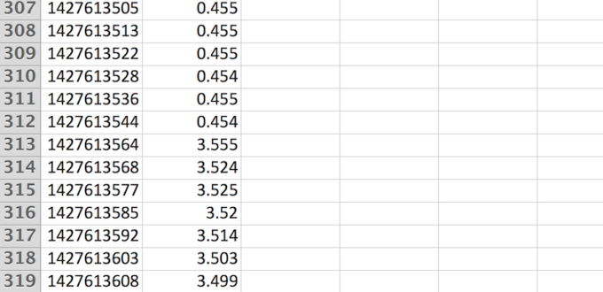
The final item to look at here is the data download button – to the left of the Settings button. This will dump a text file that is comma delimited with two columns: timestamp in seconds and a current kiloWatt value. Open it in Excel or your favourite text editor.
As you’ll see, the timestamp frequency varies and looks to sample between 5 and 10 seconds on average. For those new to timestamps like this, it’s a very handy representation that allows time to be encoded in a single integer number. The number represents seconds since a certain date (Jan 1, 1970 midnight GMT). Convert it various ways, easiest is to use this website: epochconverter.com.

Eagle energy monitor data download as CSV file
That’s all for the basic views from the Eagle monitor web interface. Next time we’ll look at the RESTful API that lets us get at all the juicy data for our apps and further hacking.
- Geography + Data - July 15, 2021
- DIY Battery – Weekend Project – Aluminum + Bleach? - January 17, 2021
- It’s all about the ecosystem – build and nurture yours - May 1, 2020
- Learnings from TigerGraph and Expero webinar - April 1, 2020
- 4 Webinars This Week – GPU, 5G, graph analytics, cloud - March 30, 2020
- Diving into #NoSQL from the SQL Empire … - February 28, 2017
- VID: Solving Performance Problems on Hadoop - July 5, 2016
- Storing Zeppelin Notebooks in AWS S3 Buckets - June 7, 2016
- VirtualBox extension pack update on OS X - April 11, 2016
- Zeppelin Notebook Quick Start on OSX v0.5.6 - April 4, 2016
No Comments Yet